Different Shapes


I did this by using different ways of combining the shapes together to get a load of different, new shapes, that I made.

Cartoon Portrait
I cartooned my self in illustrator. It took a lot of work to do this, i added different highlights and also traced over everything with the brush tool. I really enjoyed doing this assignment.
Logo Design Assignment
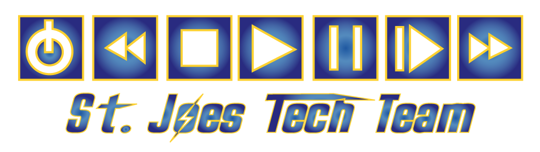
This is my logo that I did for the St. Joseph's tech team. I did not really do anything new to it, but simply refreshed it to make it look more modern. I added the blue and yellow to represent St. Joe's because we are laser, and also adding the lighting bolt to represent that.
10 Competitive Logos


|
This is the Tech Brain logo I like this logo because they are actually representing their company, (the brain), and also picked two colours that look well together, and I like it.
|
This the the Telephant logo, I don't like this logo because it does not really represent the company, and I feel that the logo is missing something.
|
This is the Ahost logo. I don't really know how I feel about this logo because I like the squares, and the colours of it, but I feel like they could change the text colour.
|
This is the ConnectIt logo. I really like this logo because I like the shape of the border, and I also like how the shapes in the border are about to connect, which is what there company is named.
|
This is the Flex Net logo. I like the colours of this logo because I feel they go well together, and I also like the big F to show their company is Flex technology.
|


|
This the the Cyber Tree logo I like this logo because it is simple, yet it looks good. I like how the cords look like a tree, and I also like the blue and orange together.
|
This the the Eye Technology logo. I like this logo because the colour of the font, and the shape goes well together, and I like how the shape is in the shape of an eye.
|
This is the E Tech logo. This logo is nice because they have a good balance of two colours. I also like the shape because I think it looks cool.....
|
This the the Tec-hnology logo. I don't like this logo because i don't like the colours, and I also don't like the electricity coming out of the word "Tec".
|
This is the Tech Uk logo. I kind of like this logo because I like how it's simple, but it does look like it's missing something.
|
Creative Brief
1.) The first Bank of America logo is more appropriate, because when making a logo you have to think of the audience, Who is the logo for, what company, what age? All these thoughts must be included. The second first one is a better choice because who uses banks, adults, and the second one is more for children because it is a fun font, and has stars. The second logo is inappropriate for adults, and more for children. Knowing your client and the services they provide guides your decision because you have to always know what the client wants, and what audience the logo is to. So if the client wants a logo for a child’s video game, you will make it a fun logo with a lot of different shapes, Although, if the client wants a logo for say a big company, you will need something appropriate that will attract people to it, and say, “This is the right place.”
Project Summary
-The type of service I offer is tech help. In tech team, we usually help with plays, dances, concerts, and pep rallies. We assist with lighting and sound, and ensure all your needs will be satisfied.
- I have been in business with tech team for close to a year now.
- With my new identity I hope to refresh the logo so it can look a little more modern. I also designed it to help it have that metal look with yellow around it to shows we are the St. Joseph’s tech team. I hope our new, refurbished logo will bring in and attract new members.
- My long term goals are to be able to do sound perfectly, and know how to control the sound board, set up mics to speakers, and hopefully, one day run the assemblies, and pep rallies, and concerts with out worry. Also to maybe use those skills to get a decent job some day.
Audience Profile
- My existing audience is people who are in grade nine and up. I believe that when you reach high school you reach a time where you need to consider jobs, and skills. So making this for grade nine and up gives them an opportunity to learn new skills from tech team that they can use in life, and to get a job with.
- I would like to add more grade nines to my audience, because if they join tech team early, the can learn a lot, and then in the future when they’re in grade 12 and new grade nines join, they can teach them all they learned.
Perception/Tone/Guidelines
- The colours in mind I have for my logo are blue and yellow. It is pretty obvious why I chose it, because we are lasers, and the colours of the logo are showing that we are St. Joes tech team, the best tech team around.
- I would like to incorporate the logo of the old tech team logo, but refresh it, and clean it up nicely, so it can look more modern. I also what to incorporate something that will show we are St. Joseph's tech.
Communication Strategy
- My tag line is, "We're Here for You!"
- The overall theme I am trying to tell others that we can help other with their sound needs, lighting, and everything else. Also that we are available to tech and assist.
- My new logo will be used on a t-shirt, or a sweater, because I feel it looks the best on either one of those.
Competitive Positioning
- What sets me apart from the competitors is that my logo really stands out, and it matches, and also represents who I'm working for. Also I have different gradients, and colours that go well together.
Targeted Message
- A phrase that will appropriately describe my service is "Here at your service!"
